SCROLL DOWN
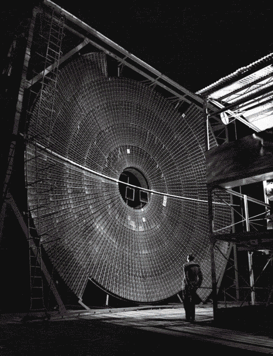
HCI | Human Computer Interactions/ICT
[GenA\ Model]From
ANTHROP\C
Claude as a Large Multi-modal Model./
HCI
//
[GenA\ Model]From
Anthropic A\
Claude as a Large Multi-modal Model. /
A\ LMM
Claude from
Anthropic
Generative Pre-trained Transformer.
A\ LMM
Claude from
Anthropic
Generative Pre-trained Transformer.
A\ LMM
Claude from
Anthropic
Generative Pre-trained Transformer.
A\ LMM as Claude A\ are fundamental guidelines that help designers use type effectively to communicate ideas, create visual hierarchy, and enhance readability in design. Below are the key typography principles that guide good design.
A\ LMM as Claude A\ are fundamental guidelines that help designers use type effectively to communicate ideas, create visual hierarchy, and enhance readability in design. Below are the key typography principles that guide good design.
Anthropic A\
as Human Factor in HCI.
Anthropic A\
as
Human Factor in HCI.
In the world of UX/UI design, icons play a crucial role in enhancing the user experience by providing clear, intuitive visual cues that guide users through interfaces. While often considered a secondary element in the broader scope of design, iconography is far from least important. Icons add clarity, improve navigation, and bring a polished, professional touch to any digital product. Designing effective icons requires the right tools, and that’s where applications like Adobe Creative Cloud 2025 and Figma shine.
In the world of UX/UI design, icons play a crucial role in enhancing the user experience by providing clear, intuitive visual cues that guide users through interfaces. While often considered a secondary element in the broader scope of design, iconography is far from least important. Icons add clarity, improve navigation, and bring a polished, professional touch to any digital product. Designing effective icons requires the right tools, and that’s where applications like Adobe Creative Cloud 2025 and Figma shine.
03. WIREFRAMING FOR Lo-FI Dev:
Wireframing
01.
Brand Strategy
02.
Digital Strategy
03.
Brand Positioning
04.
Discoverability
04. PROTOTYPING TOOLS FOR HI-FI Dev:
Prototyping
01.
Brand Strategy
02.
Digital Strategy
03.
Brand Positioning
04.
Discoverability
06. COLOUR TOOLS FOR GRADING CONTROL Dev:
Chroma
01.
Brand Strategy
02.
Digital Strategy
03.
Brand Positioning
04.
Discoverability
17. hi-end tools for Dev Productivity:
Hardware
01.
Brand Strategy
02.
Digital Strategy
03.
Brand Positioning
04.
Discoverability
Claude A\
These principles are essential for
creating a visually appealing,
cohesive, and functional design.
Claude A\UD elements rules
with three goals in mind:
Claude A\
elements rules
with three goals in mind:
Typography principles are essential for creating a visually appealing, cohesive, and functional design. They help ensure that the text is not only aesthetically pleasing but also effective in communicating the intended message. By following these principles, designers can create engaging, readable, and well-structured content
that enhances user experience.
Typography principles are essential for creating a visually appealing, cohesive, and functional design. They help ensure that the text is not only aesthetically pleasing but also effective in communicating the intended message. By following these principles, designers can create engaging, readable, and well-structured content that enhances user experience.
Typography principles are essential for creating a visually appealing, cohesive, and functional design. They help ensure that the text is not only aesthetically pleasing but also effective in communicating the intended message. By following these principles, designers can create engaging, readable, and well-structured content
that enhances user experience.
Start
We begin every project with deep discovery. Understanding your audience and strategic goals forms the foundation we build upon. This phase shapes everything that follows.
Start
We begin every project with deep discovery. Understanding your audience and strategic goals forms the foundation we build upon. This phase shapes everything that follows.
Ready
Strategy meets craft in the concept phase. We develop ideas, explore directions, and refine until the path forward is clear. Nothing moves to execution until the vision is sharp and the strategy is sound.

Ready
Strategy meets craft in the concept phase. We develop ideas, explore directions, and refine until the path forward is clear. Nothing moves to execution until the vision is sharp and the strategy is sound.
Takeoff
Execution with precision and care. Your brand comes to life through meticulous design and seamless delivery. We stay close through launch and beyond, ensuring every detail lands exactly as intended.
Takeoff
Execution with precision and care. Your brand comes to life through meticulous design and seamless delivery. We stay close through launch and beyond, ensuring every detail lands exactly as intended.
Evaluate
Execution with precision and care. Your brand comes to life through meticulous design and seamless delivery. We stay close through launch and beyond, ensuring every detail lands exactly as intended.

Evaluate
Execution with precision and care. Your brand comes to life through meticulous design and seamless delivery. We stay close through launch and beyond, ensuring every detail lands exactly as intended.
Iterate
Execution with precision and care. Your brand comes to life through meticulous design and seamless delivery. We stay close through launch and beyond, ensuring every detail lands exactly as intended.

Iterate
Execution with precision and care. Your brand comes to life through meticulous design and seamless delivery. We stay close through launch and beyond, ensuring every detail lands exactly as intended.
.
1
3