LiquidGlass/
By Apple™


Apple Liquid Glass 2027
A new era to integrate seamlessly each Apple platform.
Adopting Apple Liquid Glass
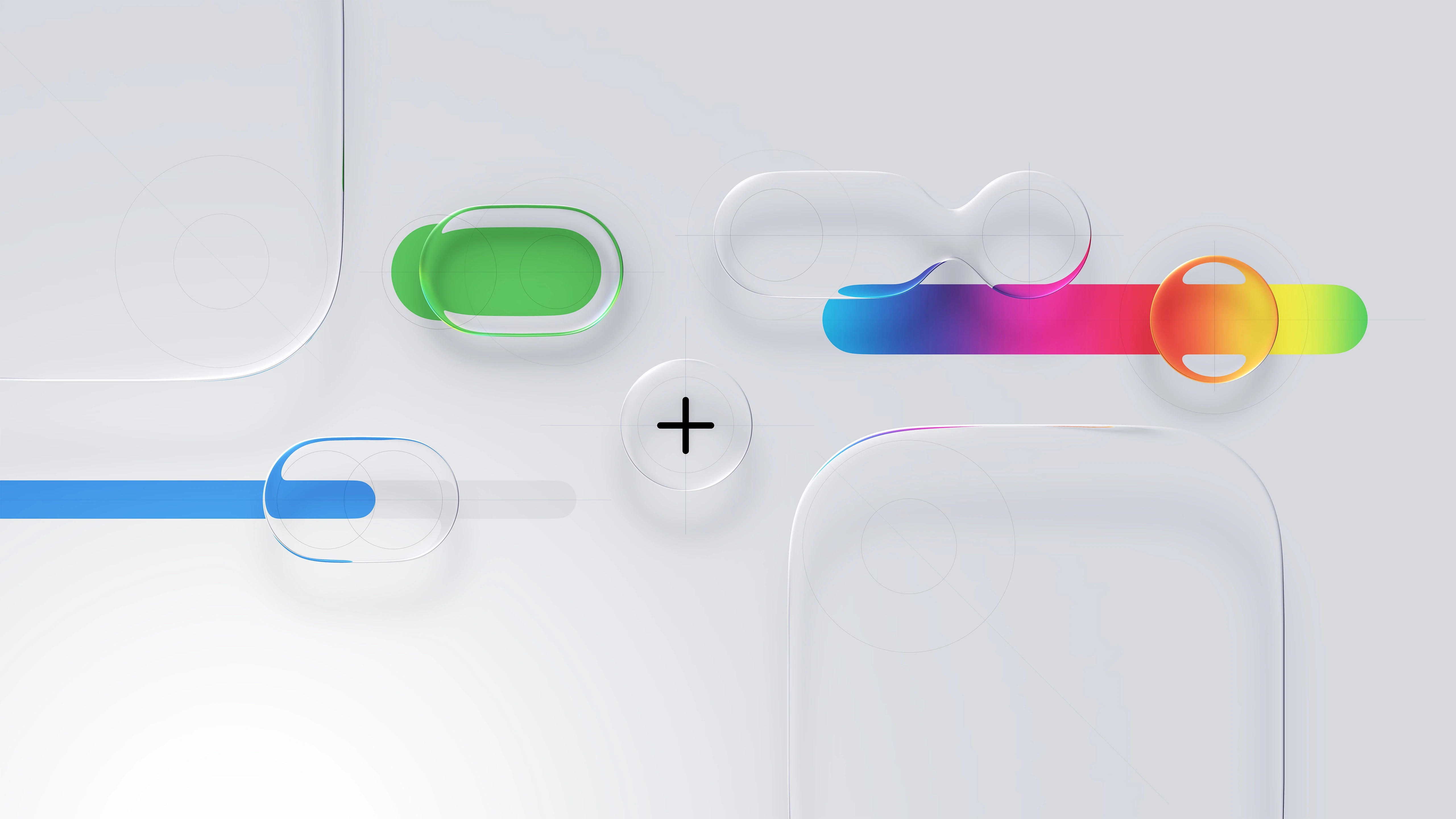
Apple Human Interface Guidelines
Think it. Build it. Deliver it. Mean it, and Tweak it.


Apple Liquid Glass 2027
Powerful scalable components in action.
HIG Considerations
Apple Liquid Glass 2027
A new era to integrate seamlessly each Apple platform.
Adopting Apple Liquid Glass





Eight Apple Design principles for UXU\ A\X
Explore fundamental principles that guide design across Apple platforms.
The most successful and enduring designs are based on a deep understanding of how people think, feel, and interact with the world. The principles here reflect this reality, and form the foundation for guidance throughout the Human Interface Guidelines.

Purpose
Create value. The best designs reflect a constant orientation toward what makes a product genuinely useful. At every stage of development, ask what your product is for and whether the design serves that purpose. Keep focused. Prioritize your app’s most important features by aligning with how people want to use it, and focus on making those features truly great. A product with a clear use is more effective at helping people meet their goals. Find new ways to solve the problem. Investigate existing solutions, and avoid re-creating them. Define what sets your product apart, and ask how your design can reflect that.
01

Agency
Stay out of the way. People use your product to get things done. Often the best way to help them do this is to get them directly to the task or content at hand. The best designs are unobtrusive and present when people need them. Give people the freedom to explore. Let them move through your interface and access features without being locked into specific flows or modes. When a guided flow is necessary, make it easy to skip or escape so people can get to the main experience quickly. Help people recover from mistakes. When people know they can reverse an action or return to a previous state, they feel free to explore, and that freedom makes your interface more inviting. Build forgiveness into your design, and make it easy. Recovering from the unexpected shouldn’t cost people their time or work.
02

Responsibility
Be fully transparent about what your product does and why. You have an opportunity to build a relationship with someone from their very first interaction. Make sure your app’s intentions are clear from the start. Provide a clear rationale when asking for permission, and when gathering data, be clear about what you collect and how you use it. Keep people’s information safe. People trust you to maintain the integrity of their data. Only collect what your product needs to function, and handle it with care. Anticipate ways it could be misused or cause harm, and put protections in place to prevent abuse and unintended consequences.
03

Familiarity
Use concepts that people know. People bring knowledge of the real world and other software to every new experience. Draw on both to make your interface feel familiar and intuitive. Keep visuals and interactions consistent. Once you establish a behavior or appearance for an element, apply it throughout your design. Consistency helps people learn more quickly, and gives them confidence that new interactions will work the way they expect. Provide clear feedback. Give people clear signals about what’s happening as they use your app. Show when controls are available, indicate when content changes, and use system patterns to display alerts and offer choices. Consistent feedback helps keep people informed and in control.
04

Flexibility
Design for everyone. People are empowered by products designed with them in mind. Think about the diversity of people who may encounter your design, and take the range of their experiences, perspectives, and needs into account. Treat accessibility as a priority from the start. Design inclusively to reach the broadest possible audience and create a better experience for all. Preserve a person’s context. Help people feel at home as your design adapts across platforms and configurations. Keep content and controls in consistent, predictable positions, and use natural animations to ease transitions. Consider a variety of input methods. People interact with their devices in different ways. Designing for as many inputs as possible — including voice, touch, keyboard, and more — means more people can use your product the way that works best for them. Approach every platform with intention. Your software should feel polished and at home wherever it runs. Give each platform you support the same level of care.
05

Simplicity
Include just what’s necessary. Simplicity isn’t minimalism. Aim for a focused, useful experience that keeps the important things close by and lets the others fall away. Be concise. When you find the simplest way to say something, it’s often the most universal, and the most helpful. Choose exactly the words you need to convey a concept or label a control. Establish hierarchy. When form and function are readily apparent, people know how to reach a desired outcome. Prioritize recognizable controls and a consistent structure that helps people understand where they are and what comes next.
06

Craft
Quality sets the tone. Every element of your design shows people how much you care. Be deliberate with each decision, and strive for stunning visuals, smooth animations, precise wording, and thoughtful audio. Experiment and iterate. Prototype early, try new approaches, and be willing to discard what doesn’t work. Set a high bar for every feature, refine it, and try again. Test your product in real-world settings to make sure it’s durable, reliable, and high-performing. Maintain your craft. Shipping isn’t the finish line. Keep your interface current with the latest platform capabilities and design patterns, and keep the quality bar high. Design is an ongoing commitment.
07

Delight
Identify the emotion you want to inspire. Not all software feels the same to use. A fitness app might energize; a meditation app might calm; a game might thrill. Know the feeling you want to evoke, and let it shape your design. Create defining moments. Every interaction is a chance to show what your software stands for. From a simple button press to an error message, consider whether each moment is an opportunity to add a touch of character that reflects the spirit of your design. Don’t mistake delight for decoration. Keep in mind that people are trying to accomplish a task, so don’t let pursuit of delight for its own sake get in the way of your product’s core purpose. Think about your overall aesthetic: Some designs benefit from a carefully considered practical touch, while others might prefer some whimsy. Experiment to find the right balance. Consider the whole. Delight emerges as the sum of the consideration that you put into your product. It’s the culmination of everything a person experiences as they use it: the freedom to act, the safety to explore, the comfort of familiar metaphors, and the flexibility to transition from one context to another. When you design with intent, focus, and care, the result is a product that people find naturally delightful.
08

Consistency Adopt platform conventions to maintain a consistent design that continuously adapts across window sizes and displays.

macOS 27
iPadOS 27
iOS 27
visionOS 27
watchOS 27
Apple™ Platforms Ecosystem
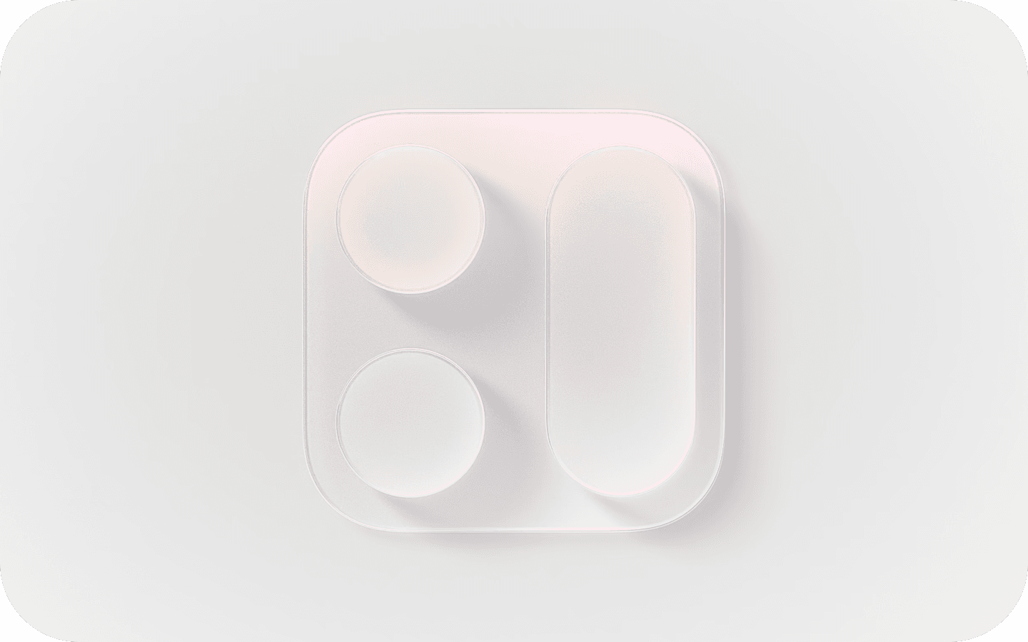
Hierarchy Establish a clear visual hierarchy where controls and interface elements elevate and distinguish the content beneath them.
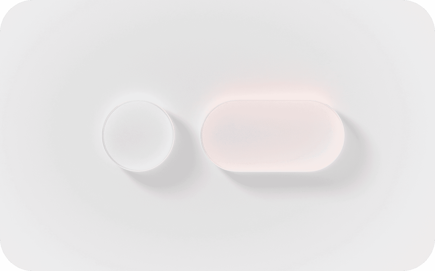
Harmony Align with the concentric design of the hardware and software to create harmony between interface elements, system experiences, and devices.
Apple’s Human Interface Guidelines [H\G]
—serve as a comprehensive resource for developers and designers as myself to create intuitive, user-centered interfaces. The guidelines emphasize principles such as clarity, consistency, and responsiveness, which are critical for crafting seamless and visually appealing user experiences.

Foundations

Patterns

Components

I/O

W3 Technologies
Apple Human \nterface Guidelines H\G™

User Interface [U\] APIs are the building blocks of digital experiences —reusable elements like buttons, input fields, modals, navigation bars, and cards that work together to create consistency and clarity across a product. Well-designed components follow established design systems and accessibility standards, ensuring a seamless user journey while also streamlining development. As a UX designer, defining and refining U\ components means balancing aesthetic precision with functional purpose—ensuring every interaction feels intuitive, responsive, and aligned with user needs across devices and platforms.

mapKIT API

healthKIT API

multimediaKIT API

homeKIT API

sceneKIT API
Xcode™ Kits/APIs

Apple™
Software Dev Kit
[SDK] — a powerful and thoughtfully crafted front-end framework designed for building Apple applications with consistent UXU\ A\X.
A11y Optimization
Animations/Effects
Automated SEO
Built-in Analytics
Content [CMS]
Components
Forms
Layout
Project Styles
P3 Color
Rich Media
Carousel
Slideshow-Tickers
Sticky Scrolling
Link Styles
Overlays
Responsive Design
Text Styles
Sticky Scrolling
Parallax Scrolling
Custom Cursors
Visual Breakpoints
.
1
3

User Acceptance Testing It’s the final phase of the software testing process, where real users (or client stakeholders) test the system to ensure it can handle required tasks in real-world scenarios, according to the business needs.
One of those behind-the-scenes terms that doesn’t always show up in creative workflows:
Validating final UI implementations against design specs.
Coordinating feedback loops w/ real users or stakeholders before launch.
Identifying design gaps during product release preparation.
Signing off on design readiness based on real-world usage scenarios.

Business Requirements
This is essential for understanding what needs to be tested. UAT is driven by business needs, so analyzing requirements ensures tests align with expected outcomes.
01
Identify Test Scenarios
Test scenarios are high-level situations that will be tested during UAT. These scenarios derive from real business processes.
03
UAT Test Plan Creation
A UAT test plan outlines the scope, objectives, timelines, responsibilities, and criteria for success. It’s a foundational document in the process.
02
Create UAT Test Cases
These are the detailed steps to validate each scenario. They include inputs, actions, and expected results.
04
Prepare Test Data
Accurate test data is needed to simulate real-world usage and validate functionality properly.
05

Run the UATs (Alpha Testing)
This is the execution phase where end users carry out the test cases to validate the system.
06

Confirm Compliance (Beta Testing)
This involves verifying that the application meets business requirements and is ready for production. It often leads to a formal sign-off.
07
Alpha Testing is an internal quality check performed before a product is released to external users. Conducted in a controlled environment—often by the design, QA, or development team—Alpha Testing helps identify functional gaps, usability flaws, and design inconsistencies early on. In UX, it’s a critical moment to validate that design intent translates into real behavior. It’s also when edge cases, accessibility concerns, and responsive performance are examined under realistic but supervised use.
Beta Testing happens after Alpha, involving real users outside the core product team. It’s the product’s first exposure to live feedback in authentic environments. For UX, Beta Testing offers essential insights into user satisfaction, behavioral trends, and overlooked pain points. It allows you to measure if design decisions resonate with users at scale—and whether adoption flows, interaction patterns, or copy choices need refining before the full launch.

.
1
3