LiquidGlass/
By Apple


Apple Liquid Glass 2026
A new era to integrate seamlessly each Apple platform.
Adopting Apple Liquid Glass
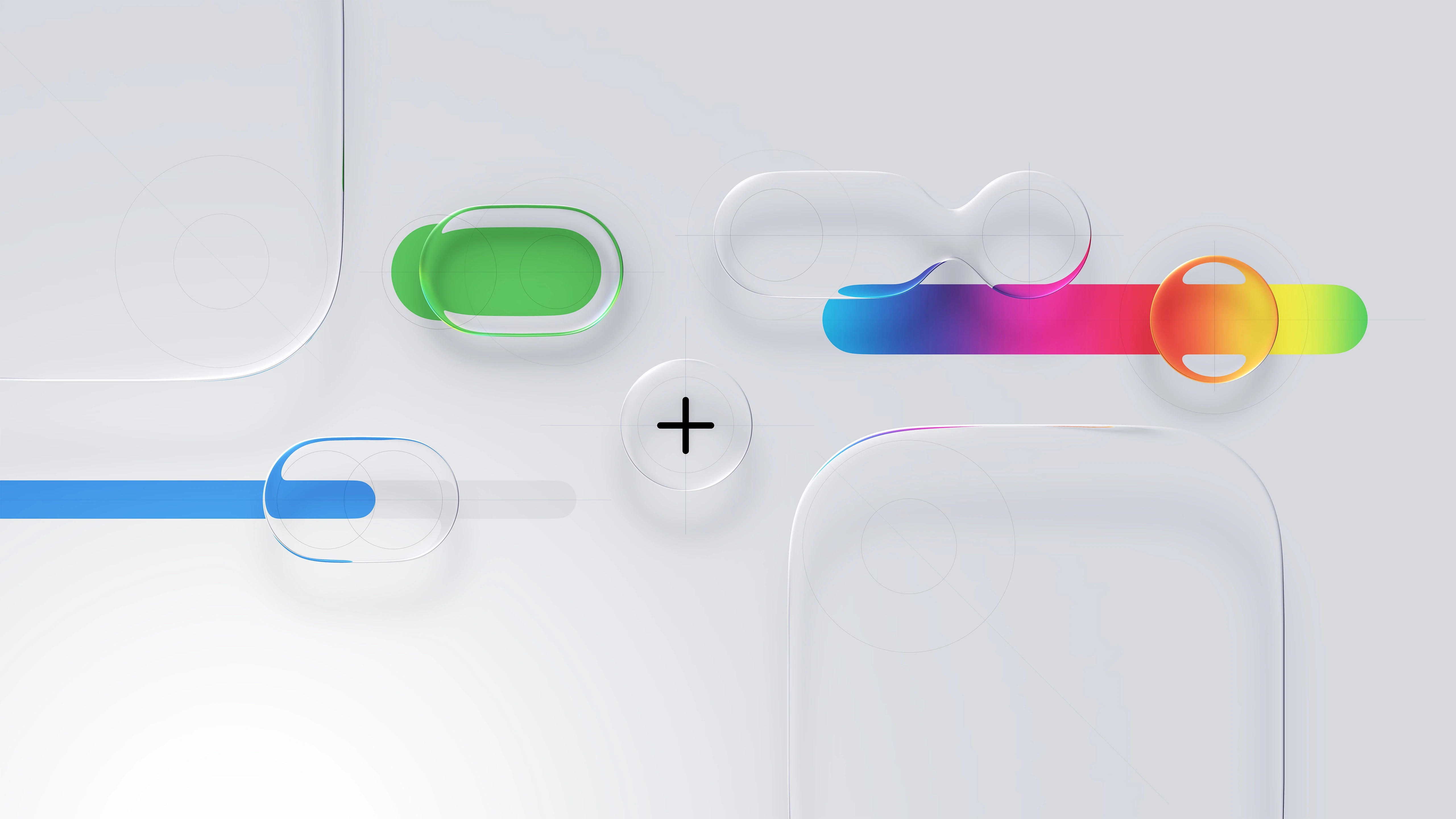
Apple Human Interface Guidelines
Think it. Build it. Deliver it. Mean it, and Tweak it.


Apple Liquid Glass 2026
Powerful scalable components in action.
HIG Considerations
Apple Liquid Glass 2026
A new era to integrate seamlessly each Apple platform.
Adopting Apple Liquid Glass


Consistency Adopt platform conventions to maintain a consistent design that continuously adapts across window sizes and displays.
macOS 26
iPadOS 26
iOS 26
visionOS 26
watchOS 26
Apple™ Platforms Ecosystem

Hierarchy Establish a clear visual hierarchy where controls and interface elements elevate and distinguish the content beneath them.

Harmony Align with the concentric design of the hardware and software to create harmony between interface elements, system experiences, and devices.

Apple’s Human Interface Guidelines (HIG)
—serve as a comprehensive resource for developers and designers as myself to create intuitive, user-centered interfaces. The guidelines emphasize principles such as clarity, consistency, and responsiveness, which are critical for crafting seamless and visually appealing user experiences.

Foundations

Patterns

Components

I/O

W3 Technologies
Apple Human Interface Guidelines HIG™ 2025

User Interface (UI) APIs are the building blocks of digital experiences. —reusable elements like buttons, input fields, modals, navigation bars, and cards that work together to create consistency and clarity across a product. Well-designed components follow established design systems and accessibility standards, ensuring a seamless user journey while also streamlining development. As a UX designer, defining and refining UI components means balancing aesthetic precision with functional purpose—ensuring every interaction feels intuitive, responsive, and aligned with user needs across devices and platforms.

mapKIT API

healthKIT API

multimediaKIT API

homeKIT API

sceneKIT API
Xcode™ Kits/APIs

Apple
Software Dev Kit
(SDK™) — a powerful and thoughtfully crafted front-end framework designed for building Apple applications with consistent UX/UI.
A11y Optimization
Animations/Effects
Automated SEO
Built-in Analytics
Content (CMS)
Components
Forms
Layout
Project Styles
P3 Color
Rich Media
Carousel
Slideshow-Tickers
Sticky Scrolling
Link Styles
Overlays
Responsive Design
Text Styles
Sticky Scrolling
Parallax Scrolling
Custom Cursors
Visual Breakpoints
.
1
3

User Acceptance Testing It’s the final phase of the software testing process, where real users (or client stakeholders) test the system to ensure it can handle required tasks in real-world scenarios, according to the business needs.
One of those behind-the-scenes terms that doesn’t always show up in creative workflows:
Validating final UI implementations against design specs.
Coordinating feedback loops w/ real users or stakeholders before launch.
Identifying design gaps during product release prep.
Signing off on design readiness based on real-world usage scenarios.


Alpha Testing is an internal quality check performed before a product is released to external users. Conducted in a controlled environment—often by the design, QA, or development team—Alpha Testing helps identify functional gaps, usability flaws, and design inconsistencies early on. In UX, it’s a critical moment to validate that design intent translates into real behavior. It’s also when edge cases, accessibility concerns, and responsive performance are examined under realistic but supervised use.

Beta Testing happens after Alpha, involving real users outside the core product team. It’s the product’s first exposure to live feedback in authentic environments. For UX, Beta Testing offers essential insights into user satisfaction, behavioral trends, and overlooked pain points. It allows you to measure if design decisions resonate with users at scale—and whether adoption flows, interaction patterns, or copy choices need refining before the full launch.

.
1
3